
Style Guide
Buttons
Sections
Blog Display Grid
Displays 6 blogs on page load and can display more with the “Load More” button at the bottom. This block has no fields and is not editable.

Writing Killer Ad Copy: Tips to Boost Your Click-Through Rates

Is it Time to Add AEO to Your Marketing Plan?

The Hidden Branding Power of Your Social Media Platform Choice
Advertising is More Than Slogans and Cute Jingles

SEO vs. SEM: Understanding the Key Differences

In Marketing, You Can’t Put a Price on the Value of Curiosity
Blog Preview
Displays a specified number of blogs with no “Load More” Button. Can choose specific posts or most recent.
Add Header Here
Contact Form
To add forms, place a Simple Form and select the style you’d like. Place the Contact Form block inside of the Simple Form.
Ready to get started?
Let’s Talk.
Optimize your digital strategy
Looking to launch a new brand strategy? Need to fine-tune an existing campaign? Interested in honing or expanding your online footprint? Drop us a line for a free consultation with one of our digital marketing experts.
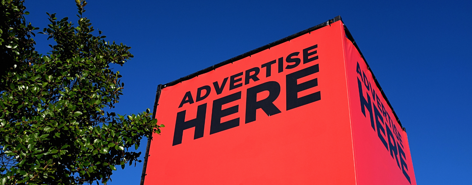
Hero Banner
Add at the top of the page to create an image header.
Heading
Home Hero Banner
Full screen header with editable headings and background image.

Title Line 1
Title Line 2
Staff Grid
Displays Staff Cards organized by leadership and team members. You can choose what information is shown for each staff member.


Containers
Centered Column Container
Centers all items into a single column.
This is a Heading in the column
This is a paragraph in the column

This is an image card in the column
Colored BG Content Container
Used to add content with a different background.
Container Customizer
Would be used inside of a Colored BG Content Container to format the items. Can choose to be in a row or column, the alignment of items, and the alignment of text, and whether the content wraps on said row or column.
Content Card Container
Used to format Content, Image, and Career cards.
Lorem ipsum dolor sit amet
Content Card
Pretium vulputate sapien nec sagittis aliquam malesuada bibendum arcu vitae. Mattis enim ut tellus elementum sagittis.
Lorem ipsum dolor sit amet
Content Card
Pretium vulputate sapien nec sagittis aliquam malesuada bibendum arcu vitae. Mattis enim ut tellus elementum sagittis.
Lorem ipsum dolor sit amet
Content Card
Pretium vulputate sapien nec sagittis aliquam malesuada bibendum arcu vitae. Mattis enim ut tellus elementum sagittis.
Image Card

Header
Pretium vulputate sapien nec sagittis aliquam malesuada bibendum arcu vitae. Mattis enim ut tellus elementum sagittis.
Total Compensation: $0 – $0
Content Card Slider Container
Used with a Colored BG Content Container to display and format the Content Card Slider.


Tabbed Content Container
Wrapper that formats and controls the functionality of the tabs for displaying Tabbed Content. Tabbed Content cannot be placed outside of the Tabbed Content Container.
This is Tabbed Content. Add more Tabbed Content blocks in this container to create more tabs.
This is another tab.
Testimonial Section
Actually a container for the contents above Testimonial Slider to overlap.
OUR BUSINESS
IS BUILT
ON RELATIONSHIPS
We treasure our long-term partnerships with marketing departments, businesses, and organizations large and small.
We help entities across industries develop and implement inbound marketing solutions that raise growth and awareness — and ultimately bottom lines.

Components
Career Card
Used to display open career positions. Change cover image and edit the text. The “Apply Now” button links to the Apply Now Page and the “Learn More” button can be linked to a PDF of the job details or deleted if not needed.
Header
Pretium vulputate sapien nec sagittis aliquam malesuada bibendum arcu vitae. Mattis enim ut tellus elementum sagittis.
Total Compensation: $0 – $0
Client Image Grid
Displays client logos in a grid with the option to add a hyperlink. Intended to link to their case studies page (and used with a white background).
Content Card
Informational cards with editable text and an icon selector.
Lorem ipsum dolor sit amet
Header
Pretium vulputate sapien nec sagittis aliquam malesuada bibendum arcu vitae. Mattis enim ut tellus elementum sagittis.
Content Card Slider
Informational cards that are viewed with a slider. 2 cards show on larger screen while only 1 will show on smaller. Edit the fields to customize each card. Add more with the “Add Row” button.
Home Page Percents
Intended to use on a dark background, displays numerical data with number scroll that activates the first time it is within the screen. Percentages and text fields are optional.
This is a percent.
Client
This is a percent.
Client
This is a percent.
Client
Icon
Used in Content Card to display a chosen icon.
Image Card
Formats an image the same as Content Cards.

Leadership Card
Used on the about page to format the leadership section. Technically just a container for an image and text.

2020 – LeadPoint Digital was founded by Steve and Brad – backed by decades of successful entrepreneurial ventures, experience, and consistently exceeding client expectations.
Simple Form
Used to style the layout of forms. Either select a Gravity Form or place the Contact Form block inside. Uses the background that it’s on.
Staff Card
Choose one card to display and it’s information.
Testimonial Slider
Grabs all the Testimonials and displays as a slider that can be viewed with the arrow buttons or by sliding with the mouse (or finger on mobile).