Web Design 101: How Color Psychology Can Help You Build a Site that Converts
By LeadPoint Digital
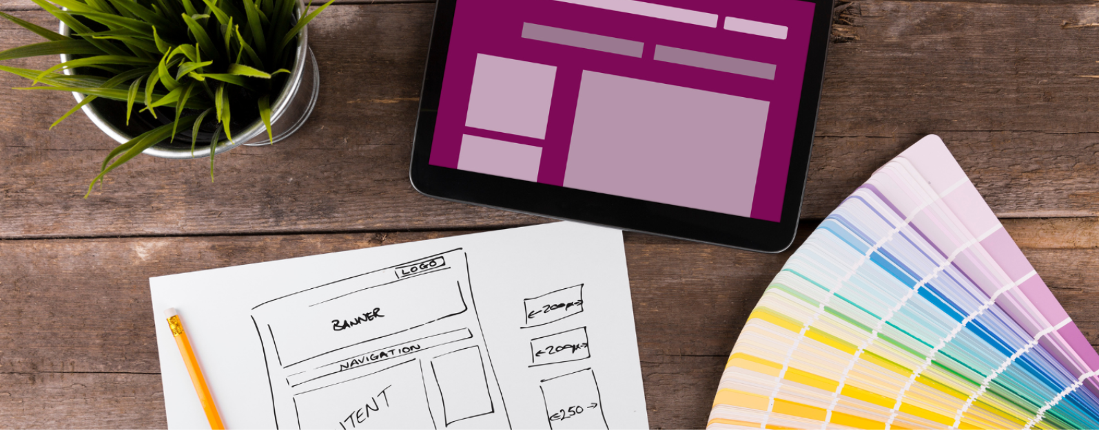
In today’s world, having a great website is non-negotiable for business. It’s your top piece of marketing collateral that functions as your calling card, brochure, catalogue, and even point of sale. While there are many aspects to designing a website that’s both beautiful and functional, in this article we’re going to focus on one of the most basic: color.
Choosing the right color palette for your website is one of the first choices you’ll make when it comes to design. In fact, it’s so foundational that it’s easy to overlook. But do so at your peril. Color is a powerful communication tool that speaks volumes to your potential customers and choosing the wrong one can be bad for business. Applying color psychology to your design choices can help you avoid this pitfall and build a website that converts.
What Is Color Psychology and Why Is It Important for Websites?
Color psychology is the practice of selecting colors to convey ideas, values, and characteristics or to evoke an emotional response in the viewer. People across time and culture have long understood that color is powerful. While different cultures can attach different meanings to color, in web design and branding, colors generally have an agreed upon meaning.
Your website should make a good first impression, which research shows takes only seven seconds to create. Our brains move at lightning speed to determine if a business is likable, trustworthy, and competent. Choosing colors that are misaligned with your brand personality, product, or service can break trust with your target customers and cost you. Luckily, the solution is within reach. By applying color psychology to your website design, you’ll communicate the right message at a glance.
How To Use Color Psychology
The simplest way to use color psychology is to identify on one or two main features of your business and brand. For example, if you sell financial services then you might want to project a sense of stability and trustworthiness to your potential customers. By contrast, if you run an ice cream shop, you might want to convey a sense of fun and play.
Once you’ve identified the characteristics you want to communicate about your business, use the following list to find which colors suit your business best.
- Red represents passion, energy, love, danger, power, excitement. It’s commonly used for warning signs, romance, or urgency and promoting limited time deals.
- Blue is the color of the sky and the ocean and represents calmness, trust, stability, tranquility, intelligence, and loyalty. It’s a color that’s all around us and as such is often favored in corporate branding, healthcare, and financial institutions.
- Green is another plentiful color in the natural world and as such represents nature, growth, harmony, freshness, safety, fertility, and money. You might see green in environmental campaigns, health and wellness, and financial services.
- Yellow is a high energy color that calls to mind the warmth of the sun. As such, it represents happiness, optimism, creativity, warmth, caution, and energy. You’ll find it used for warning signs, children’s products, and food and beverage industry as it’s said to stimulate hunger!
- Orange is perfect for conveying enthusiasm, creativity, success, encouragement, energy, and sociability. It’s great for food and beverage, sports, and travel companies.
- Purple is complex and deep. It’s often associated with royalty, luxury, spirituality, creativity, wisdom and mystery. Purple is a great choice for beauty products, high-end brands, or spirituality and wellness.
- Pink is all about love, compassion, nurturing, femininity, playfulness, romance. Pink could be a great option for fashion and apparel, sweets and desserts, or children’s products.
- Black is a without a doubt a power move. It conveys power, elegance, sophistication, timelessness, and formality. This bold color is often the choice of luxury goods, formal events, fashion, or technology.
- White is all about purity, cleanliness, simplicity, innocence, and peace. It’s frequently chosen by healthcare, the wedding industry, and household products.
- Brown is another color commonly found in nature and as such conveys a sense of stability, reliability, wholesomeness, comfort, and earthiness. Reach for this color if you sell natural and organic products, logistics, or food and beverages.
Be Consistent in Your Branding
Within each of these broad color categories is a vast range of tints and hues. You can play with the saturation of each color until you find the perfect version for you. Just remember that consistency is key. Using the exact same shade across your website and brand is a critical part of driving home your messaging, building trust with your user, and developing brand recall that will help you make the sales you’ve worked so hard for.
Get Expert Website Development with LeadPoint Digital
Choosing the right colors for your website is foundational, but it’s just the beginning when it comes to having a website that bolsters your business. At LeadPoint Digital, we’re masters at melding gorgeous design with high usability, and an optimized construction so your customers can do what they came to do—business with you!
LeadPoint Digital specializes in search engine optimization and advertising, content marketing, and website design. If you’re ready to get a website that effortlessly tells the story of your brand while delivering outstanding usability for your customers, contact us!